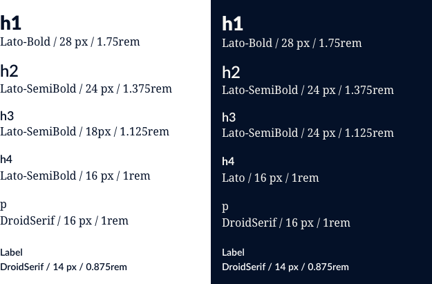
Color

Primary color palette

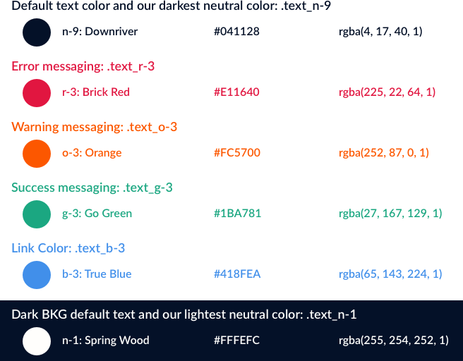
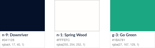
Our primary palette is comprised of green, white, and blue. These colors are present across the product. Downriver and Spring Wood work as background to text compliments. If Downriver is the background Spring Wood is the text color and visa versa. Go Green’s is used as a call to action (CTA) and to signify success.

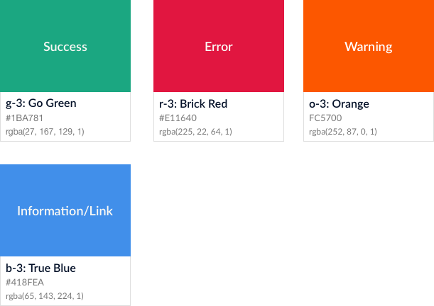
Secondary color palette

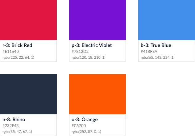
The secondary palette contains color to assist in system: Brick Red is to communicate error, Orange is used to communicate a warning, and True blue is used to communicate general info.

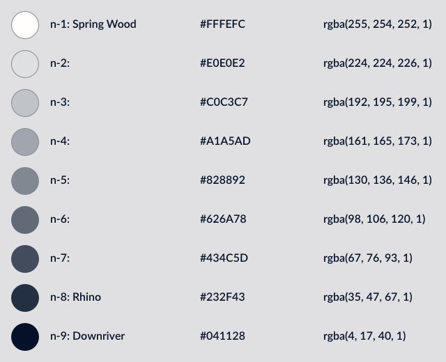
Nuetral palette and shading

Neutral palette ranges from n-1 to n-9 in order from light to dark.
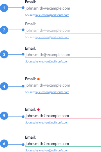
States

There are 4 major colors used to help communicate states across the system.

Typography

Feature Font: Lato

Lato will be used in all situations except when writing normal body copy. Some examples of Lato are headers, labels, links, and more.

Paragraph Font: Droid Serif

Driod Serif is used exclusively for paragraph text. Anything that inside a <p> tag will be Droid Serif.

Font Sizes

Below is a table showing the progression of text size and weight from <h1> to <p>. In sketch use the px measurement where as rem will be used in development using 16 as the base measurement

Color & States

Communicating state is crucial to an efficient user experience. Below are the colors we will use to help communicate system status.

Layout

8 Point System

Use multiples of 8 to define dimensions, padding, and margin of both block and inline elements.

When the only contents of a block element are text (e.g. buttons), set the text to a size consistent with the rest of your UI and/or the specific platform, then use padding consistent with the 8pt system to determine the size of the block element. In cases of a full-width element, use padding to determine height and a consistent horizontal margin to determine width.

Horizontal Column Layout System

Omega will be using a 12 column grid system with a 16px gutter.

Data Entry

Forms

Common form components include text input, text fields, checkboxes, radio buttons, single-selects, date pickers, toggles, and buttons . When designing a form it’s important to consider it’s pieces such as labels, placeholder text, info, feedback and state.

Form Anatomy

1. Labels: Standard label alignment is left-aligned with the field underneath using sentence case.

2. Placeholder text: Placeholder text will be left-aligned, sentence cased and using color n-5. Placeholder text will only be used to display required format of input.

3. Info: Text here will provide information that could be valuable to the user in the moment. This text can be interactive and automatically fill the input when answered.

4. Feedback & Validation: This badge is used to help surface info, warning, or error. More information on the types and use of feedback & validation below in States. It should be placed 4 pixels off of the label and for a radio question 4 pixels off the final option.

Form States

1. Default

2. Disabled

3. Focus: When a user clicks into an input it will turn blue to show focus.

4. Warning: Warning will be used for empty fields that need to be completed after a user attempts to submit a form turning the input yellow. A message will be used next to the warning icon to help solve the error. See inline dialogs under Messaging for more information on this type of message

5. Error: An error will be used when a user has entered incorrect information, this will be activated when leaving the field (onChange()) or form submit turning the input red. A message will be used next to the error icon to help solve the error. See inline dialogs under Messaging for more information on this type of message

6. Success: A required input has been complete without any error.

Input Types

1. Text Input

2. Select

3. Radio When a user clicks into an input it will turn blue to show focus.

4. Address: This input is unique in that it uses multiple lines of text inputs but only one label.

5. Checkbox:

Messaging

Overview

Use messages to communicate conditions, indicate an event, or to show responses to user actions. Content can include authentication, information, confirmation, warnings, and error messages. It is important to specify which of these the content of the message falls under in order to choose the correct icon and colors.

Inline dialogs

Inline dialoges are triggered by an action:
1. Clicking or hovering on a badge
2. Hovering on text with a dotted underline.
3. Clicking on a tooltip
Use Inline messages to alert users to a required action or important information.

Toasts

A toast appears in reaction to user action or to communicate a system status. Toasts appear at the bottom center of the screen and they are visible until a user dismisses them or the defined duration elapses. They show 1–2 full sentences (no truncation), including an inline link (when appropriate), and an X to close.

A toast can show one of the following states:

1. Error: when a user completes an action but cannot proceed due to user error or system error. duration:null
2. Informational: when a user completes an action, but there are some additional info to be shown. duration:5000ms
3. Success: when a user completes/executes an action. duration:5000ms
4. Warning: when a user completes an action but cannot proceed due to empty required fields. duration:5000ms

Buttons

Button Types

We have three different button types

1. Solid Button: Used on primary buttons. Have a shadow if enabled.

2. Outline Button: Used much less frequently and mostly for icon buttons. Will fill with semi opaque color on hover and opaque color and white text on click.

3. Flat Button: Used on secondary buttons. Most frequently used button, often used for signaling tasks/actions and their completion status. Can be underlined.

Button Colors/States

1. Disabled Solid:
   - color: #626A78 (n-3)
   - background-color: #C0C3C7 (n-6)

2. Disabled Outlined:
   - color: #626A78 (n-3)
   - color: #626A78 (n-3)

3. Flat Disabled:
   - color: #626A78 (n-3)